Blog Post 0 - Palmer Penguins
Covering the basics of visualization in Matplotlib
In this blog post I am going to cover some of the quick tools in I use when I explore data in matplotlib, some basic functions you could create to help with creating many plots, and finally go in-depth with one plot with colorings to make a presentation-ready chart.
Quick Introduction to Matplotlib.pyplot
First off, Matplotlib is a complete package containing, among other modules, pyplot. Pyplot in particular gives users access to plenty of functionality to create all sorts of visualizations. It has lots of in-depth customization options to explore, but for now we will just use the basic styling.
Lets start off by using the import statement provided to us for our penguins dataset, and bring in matplotlib.pyplot at the same time
import matplotlib.pyplot as plt
import pandas as pd
url = "https://raw.githubusercontent.com/PhilChodrow/PIC16B/master/datasets/palmer_penguins.csv"
penguins = pd.read_csv(url)
We can quickly throw together a bar chart comparing some of our columns. Let us consider the difference in Culmen Lengths between different species of penguin. (Apparently a penguin’s culmen is the upper margin of the beak or bill!)
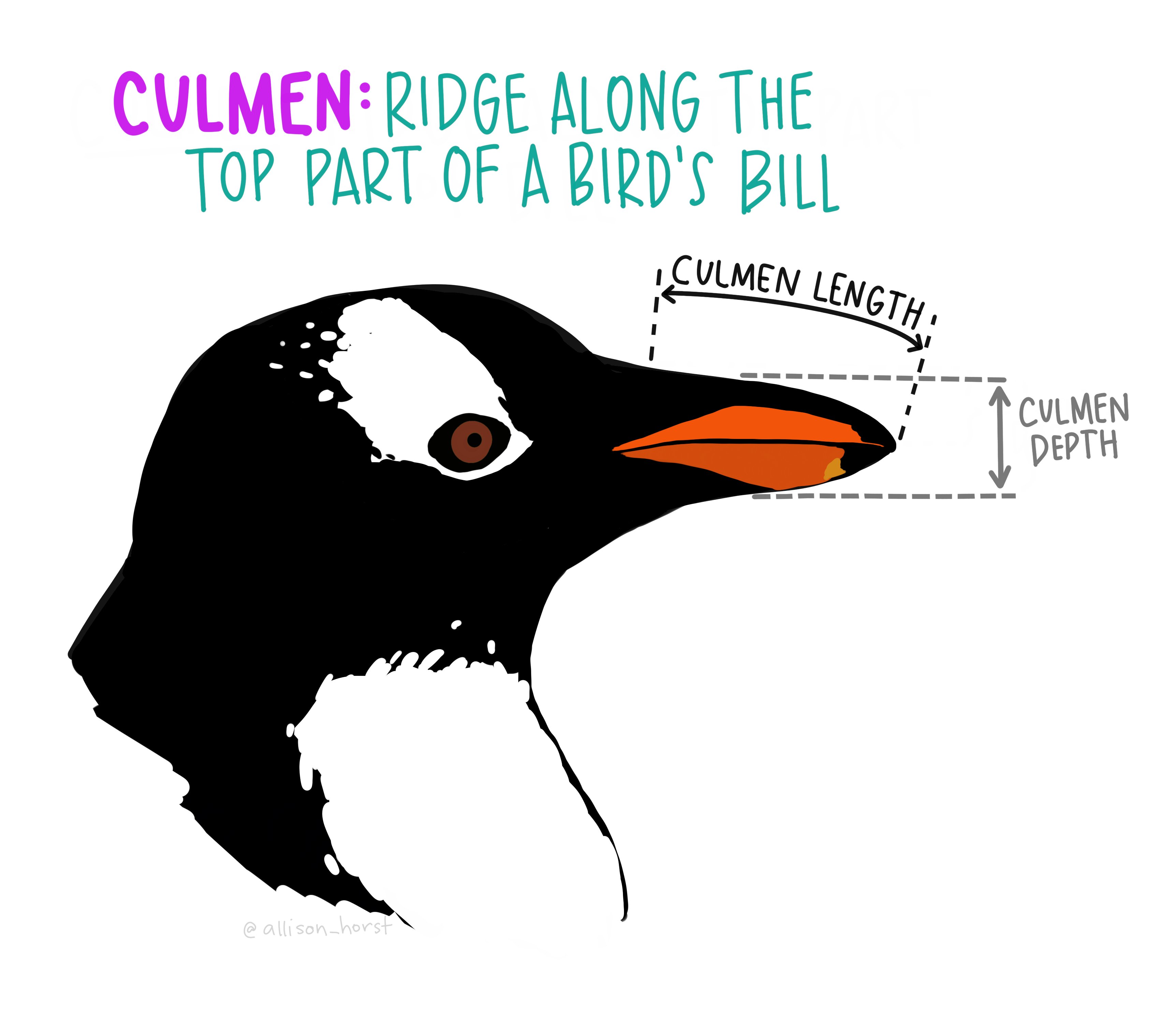
Artwork by @allison_horst
Bar Charts
Our code to make our chart will start with computing the means the Culmen Lengths when grouped by the Species. Then, we use the simple plt.bar method! Also, plt.show is something we’ll get used to adding to display our charts.
groupby = "Species"
column = "Culmen Length (mm)"
computed = penguins.groupby(by=groupby)[column].mean().reset_index()
plt.bar(computed[groupby], computed[column])
plt.show()
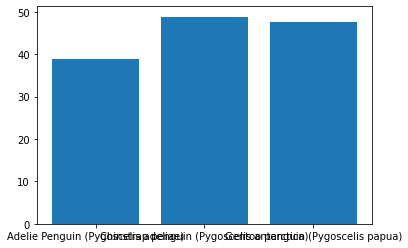
Well… this is just our first draft, and there are a ton of different ways to make this look nicer.
Let’s add some more methods, plt.xlabel, plt.ylabel, and plt.title to clarify things. Also those grouping names are quite long so we’ll use some string methods to grab the first word.
groupby = "Species"
col = "Culmen Length (mm)"
computed = penguins.groupby(by=groupby)[col].mean().reset_index()
plt.bar(computed[groupby].str.split().str[0], computed[col])
plt.xlabel(groupby)
plt.ylabel(col)
plt.title("Average " + col + " by " + groupby)
plt.show()
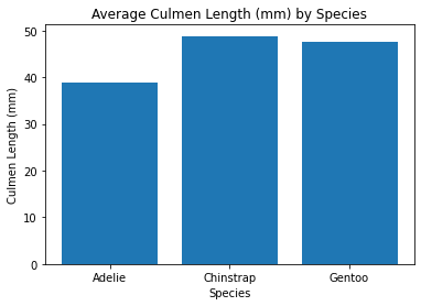
This is already a large improvement, but what if we aren’t satisfied with these variables. Maybe we want to do this for multiple different variables and see which chart shows the biggest difference!
We’ll bundle this code into a neat function for us to use.
def simple_bar_chart(groupby: str, col: str) -> None:
    """Create a simple barchart using our penguins dataset.

    Keyword arguments:
    groupby -- (str) column of penguins to grop each bar by
    col -- (str) column to display
    """

    computed = penguins.groupby(by=groupby)[col].mean().reset_index()
    plt.bar(computed[groupby].str.split().str[0], computed[col])
    plt.xlabel(groupby)
    plt.ylabel(col)
    plt.title("Average " + col + " by " + groupby)
    plt.show()
This function implements the same methods as the previous chart, but allows us to do everything much faster. Like this:
cool_columns = [
    'Culmen Length (mm)',
    'Culmen Depth (mm)',
    'Flipper Length (mm)',
    'Body Mass (g)'
]
for col in cool_columns:
    simple_bar_chart(groupby='Species', col=col)

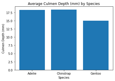
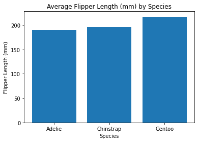
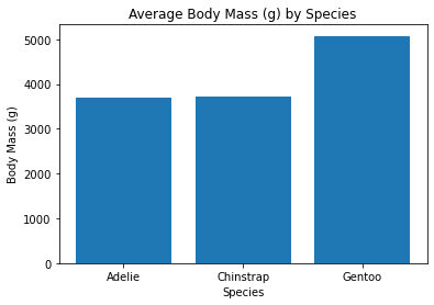
Now we get to see a bunch of tables and we can see that those Gentoo Penguins are larger than our other penguin species.
Scatter Plots
Let’s say now that we’re tired of boring old Bar Charts. We want to see all the data points! We’ll use a scatter plot for that. We’ll just go straight into using our scatterplot function.
def simple_scatter_plot(x: str, y: str) -> None:
    """Create a simple scatter plot using our penguins dataset.

    Keyword arguments:
    x -- (str) column to display along x-axis
    y -- (str) column to display along y-axis
    """

    plt.scatter(penguins[x], penguins[y])
    plt.xlabel(x)
    plt.ylabel(y)
    plt.title("Average " + y + " by " + x)
    plt.show()
x = "Culmen Length (mm)"
y = "Culmen Depth (mm)"
simple_scatter_plot(x, y)
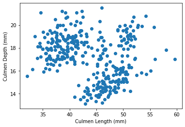
This chart looks interesting, I can almost see three clusters. I remember from the bar charts that there are 3 species of Penguin, so maybe that explains the clusters. To verify this though, let us color the point based on their species.
This actually takes a bit of work, and we’ll need to make a new complex_scatter_plot function with the new code. This function introduces a few new items: plt.figure which helps size our chart and plt.legend which gives us a legend explaining the colors in our chart. (bbox_to_anchor just helps us place the legend where we want it)
def complex_scatter_plot(x, y, groupby):
    """Create a more complex scatter plot using our penguins dataset.

    Keyword arguments:
    x -- (str) numerical column to display along x-axis
    y -- (str) numerical column to display along y-axis
    groupby -- (str) categorical column to group points by
    """

    groupings = list(penguins[groupby].unique())
    plt.figure(figsize=(8,6))
    for i in range(0 , len(groupings)):
        data = penguins.loc[penguins[groupby] == groupings[i]]
        plt.scatter(
            x,
            y,
            data=data,
            label=groupings[i]
        )
    plt.xlabel(x)
    plt.ylabel(y)
    plt.legend(bbox_to_anchor=(1.6, 1))
    plt.show()
x = "Culmen Length (mm)"
y = "Culmen Depth (mm)"
grouping = "Species"
complex_scatter_plot(x, y, grouping)
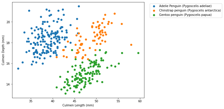 This looks really nice and I’m very happy with all the work we put in!
We learned a lot about matplotlib and the level of precision it allows with all of its methods and parameters!
This looks really nice and I’m very happy with all the work we put in!
We learned a lot about matplotlib and the level of precision it allows with all of its methods and parameters!
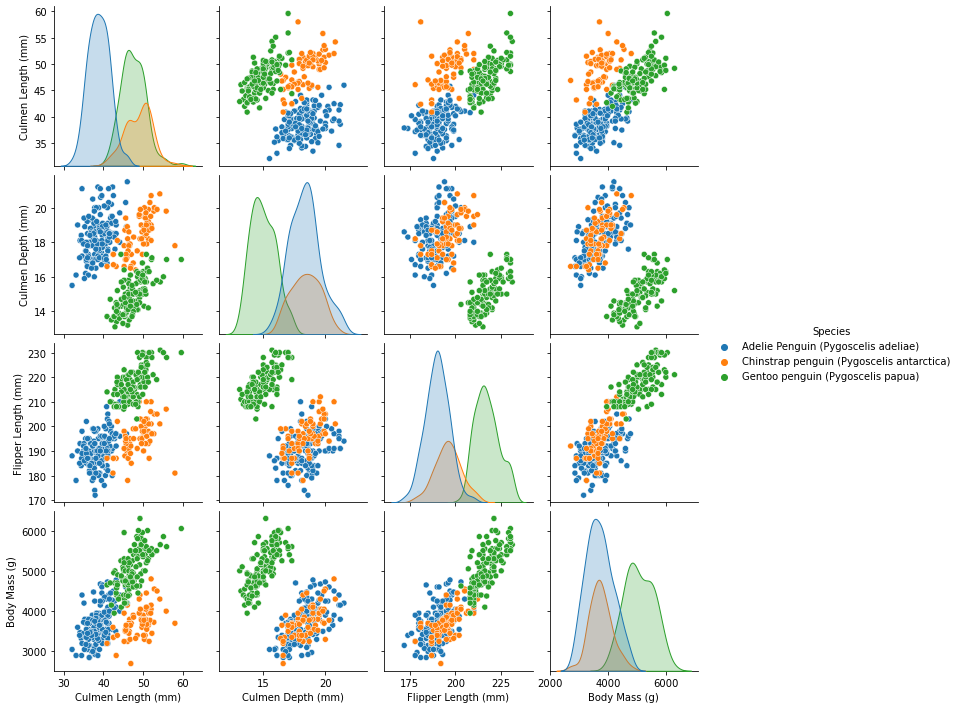
Seaborn Makes It Look Easy
Marcus Garvey once said, “A people without the knowledge of their past history, origin and culture is like a tree without roots”. I think that is similar with matplotlib and seaborn, because without knowing the basics how can one hope to learn the advanced tools? While this seaborn chart certainly isn’t perfect, I think it does a really good job for how few simple the code is. I will certainly spend more time learning seaborn in the future! =)
import seaborn as sns
sns.pairplot(penguins.drop(columns=["Sample Number", "Delta 15 N (o/oo)", "Delta 13 C (o/oo)"]), hue="Species")